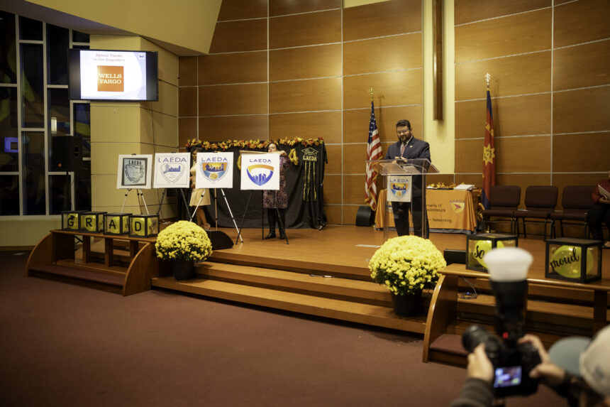
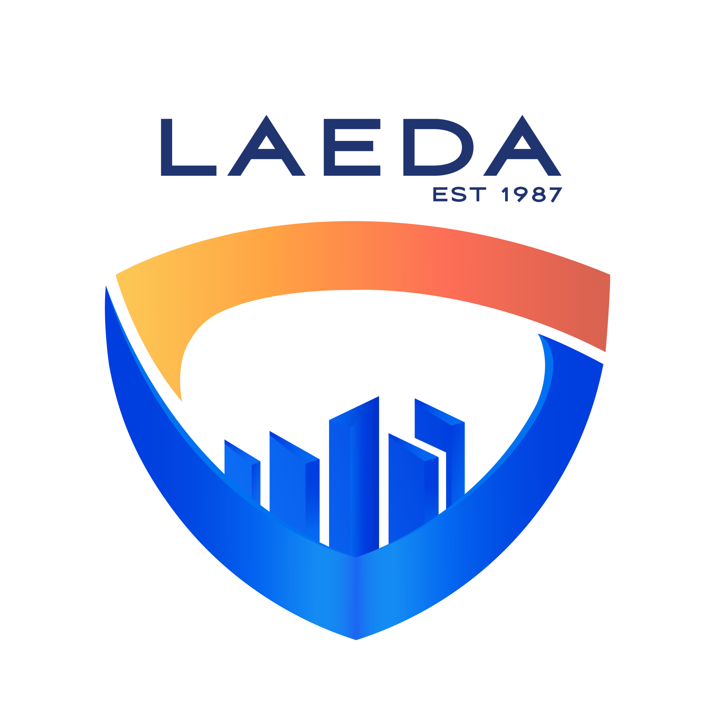
Camden, NJ – Thursday, October 17, 2024 – Family, friends and supports of LAEDA graduating class came together to gather at LAEDA’s Annual Graduation Ceremony where LAEDA’s President & CEO, Raymond Lamboy, presented LAEDA’s new and updated logo for 2024. During his remarks, he shared the meaning and evolution of the logo as the organization’s mission evolved through its 37 years of work Empowering People and Revitalizing the Community.
Displayed on the stage were the first three logos of LAEDA’s history (at left). Mr. Lamboy discussed the logos displayed, “In 1987, the first logo was a hand-drawn image of a streetscape, two hands shaking and an arrow indicating upward mobility. The streetscape indicates neighborhood revitalization and the hands shaking indicates community and coming together. All within the shield of determination and safety.
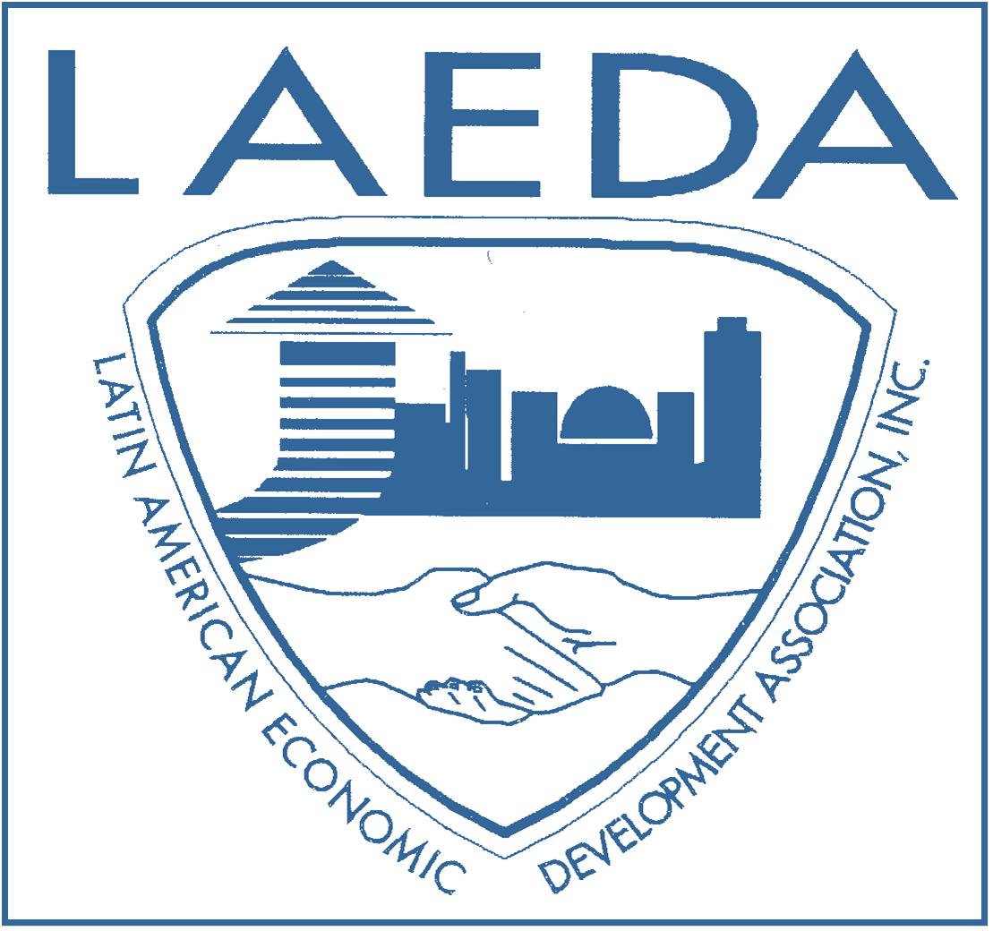
13 years later, in the year 2000, our logo continued to evolve with the revitalization of the City of Camden. The State Aquarium opened in 1992 and the aquarium dome was included in a city skyline that replaced the streetscape. The clasped hands continued indicating collaboration and community.
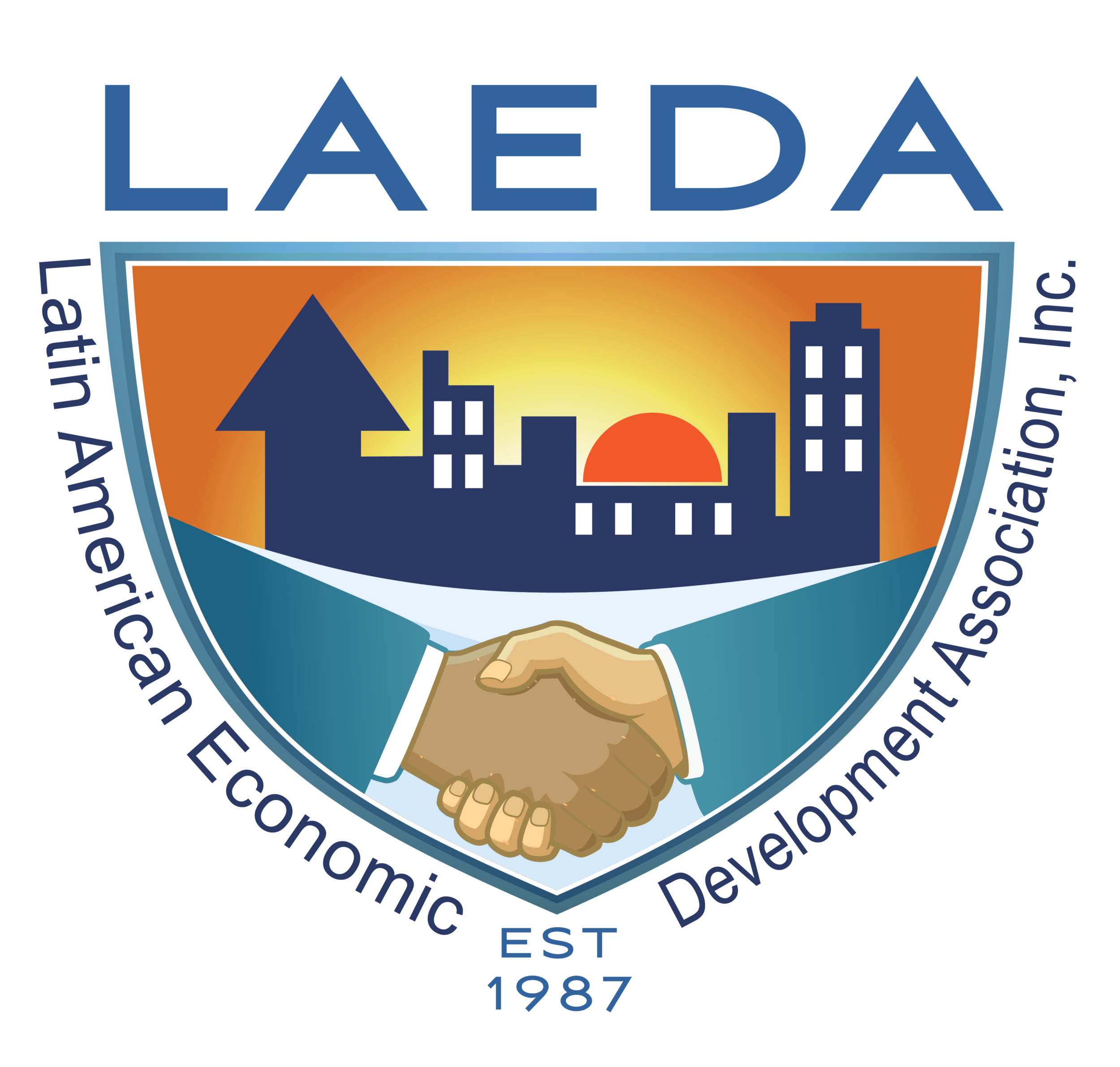
In 2010, our logo continued to change with the times. Color was added to indicate diversity. The city scape now has a sun rising over it, indicating Camden’s continued rebirth. The shaking hands are now of two different colors indicating the evolution of LAEDA’s client base and its collaboration across communities.
Since 2010, LAEDA has evolved. We now operate in multiple cities here in South Jersey, we are undertaking new and innovative programs and continue to have at our center community and collaboration. As we worked at designing our new logo, we wanted to create an image that evokes motion, that reflects our diversity and sets a limitless trajectory into the future.”
Mr. Lamboy, unveiled the new logo and described it’s meaning to the audience. “The city scape has given way to central graphics emoting skyscrapers, shaking hands have transformed into bands of orange and blue sweeping around our recognizable shield conveying motion and the coming together of communities. The white open space in the middle, leaves open the endless possibilities of the future. The Latin American Economic Development Association, Inc. has given way to LAEDA est 1987. This is in recognition of the diversity of our community of entrepreneurs and the diversity of the communities we serve. Thank you to the LAEDA team and our graphic artist, Jessica for your determination and patience in developing this forward facing image.”
As the months go by, LAEDA will be incorporating its new logo and look into all its materials, website and education materials.


